The thinking behind our latest brand campaign

Por Katie Chang
Head of Creative Strategy & Operations
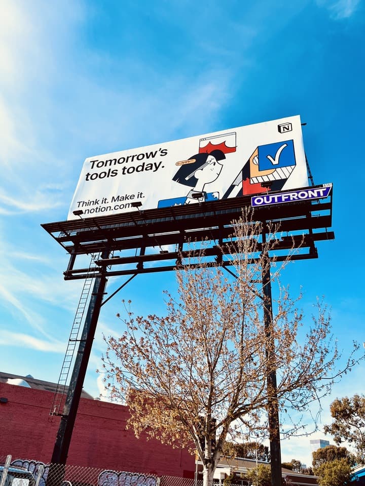
Maybe you’ve seen it on a billboard in San Francisco, or in a Tube station in London, or at a bus stop in Seoul. Our new Think it. Make it. campaign is deceptively simple—pairing bold headlines with our long-time illustrator Roman Muradov’s distinctive drawings. But beneath the surface, it’s the culmination of years of building, creating, reimagining, and growing. It’s a reflection of Notion itself.
Today, we're sharing a deeper look at the process: how we landed on Think it. Make it. as our first brand tagline, and how this kernel of an idea developed into a full-blown campaign.
Finding the words
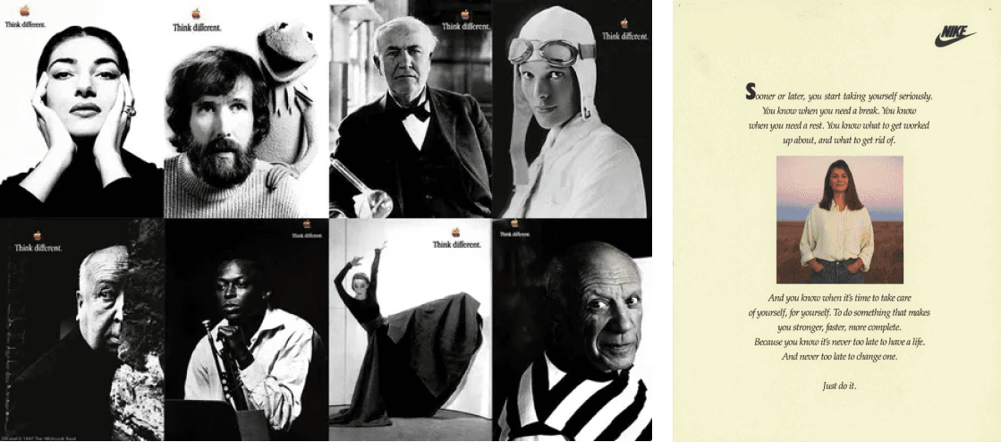
Memorable taglines go beyond words on a page; they tap into our deepest aspirations through association. Apple’s “Think different.” speaks to the innovator, “crazy enough to think they can change the world." Nike’s “Just do it.” isn’t about shoes or even athletics—it’s a call to push through perceived limits to reach new heights.
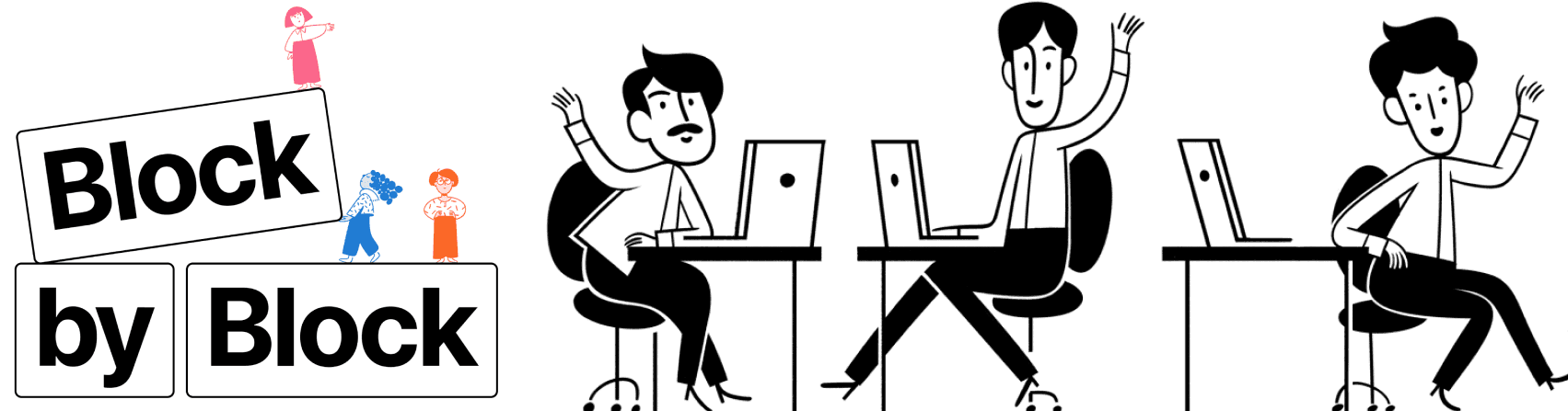
Our aim was to create a campaign that would expand people’s understanding of Notion beyond productivity software. We often describe Notion as a set of building blocks—like LEGO—that gives users infinite variations. But distilling those variations down to just three or four words is no small feat. With help from design agency, BUCK, we began by iterating on thousands of nouns, verbs, and adjectives to find something that felt just right, something unequivocally Notion.
Turning ideas into visuals
While tinkering on the tagline, we started dreaming about what this campaign could look like in the wild. From its earliest days, Notion’s brand has been illustration-driven, with smart, whimsy storytelling. Our hope was to push the boundaries while building on this foundation, starting with a few core principles:
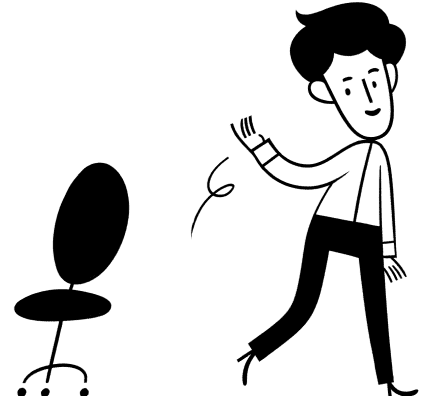
Stay true. Notion's original brand illustrations were created by Roman Muradov back when Notion had just a few employees. Even at that early stage, the intent was to stand out while capturing the essence of Notion, a balance we were committed to preserving.
“The minimalist illustrations with gestural lifework stood out among the vector illustrations that most companies were beginning to use,” says Roman. “People started telling me they got into Notion primarily because they loved the illustrations.”
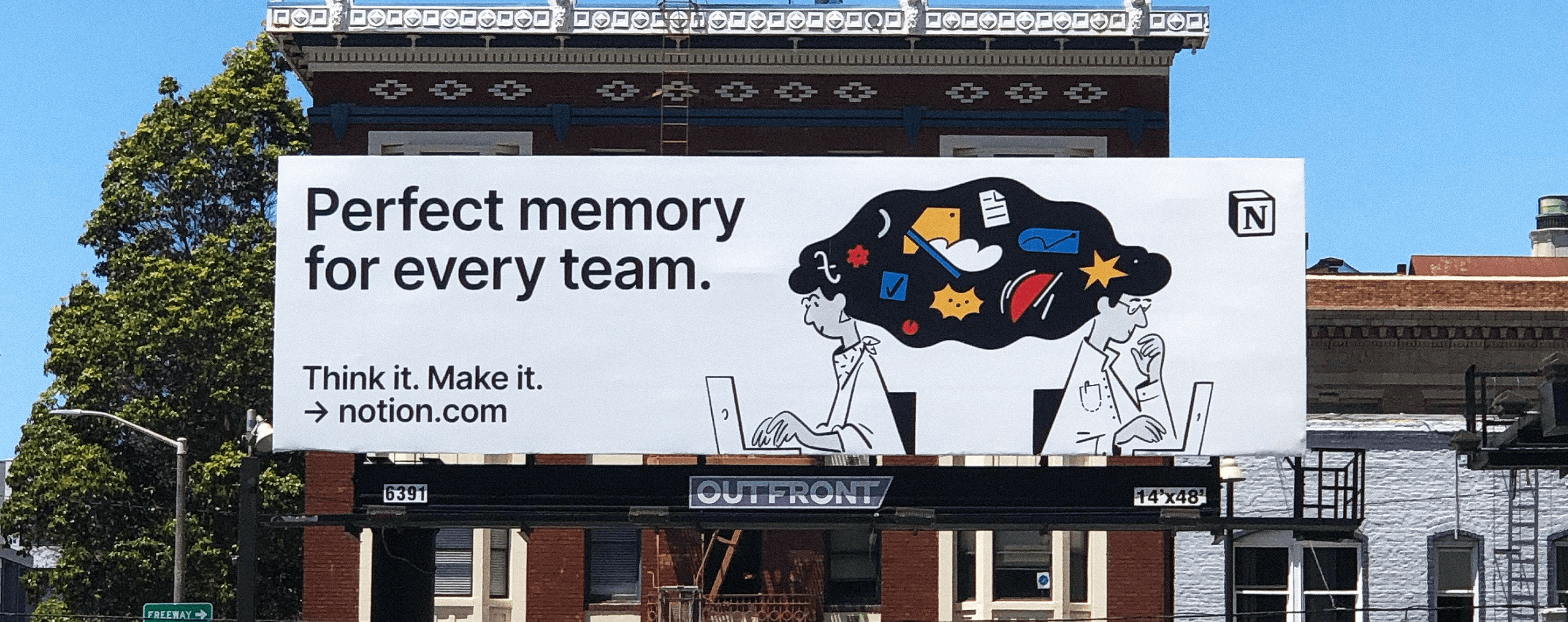
Show, don't tell. We wanted to underscore how Notion can help you develop your ideas and get more done in your life and work, individually and collectively. Add in AI, and your second brain develops a kind of perfect memory that can tap into all of your stored knowledge. But how to visually represent such an abstract concept?
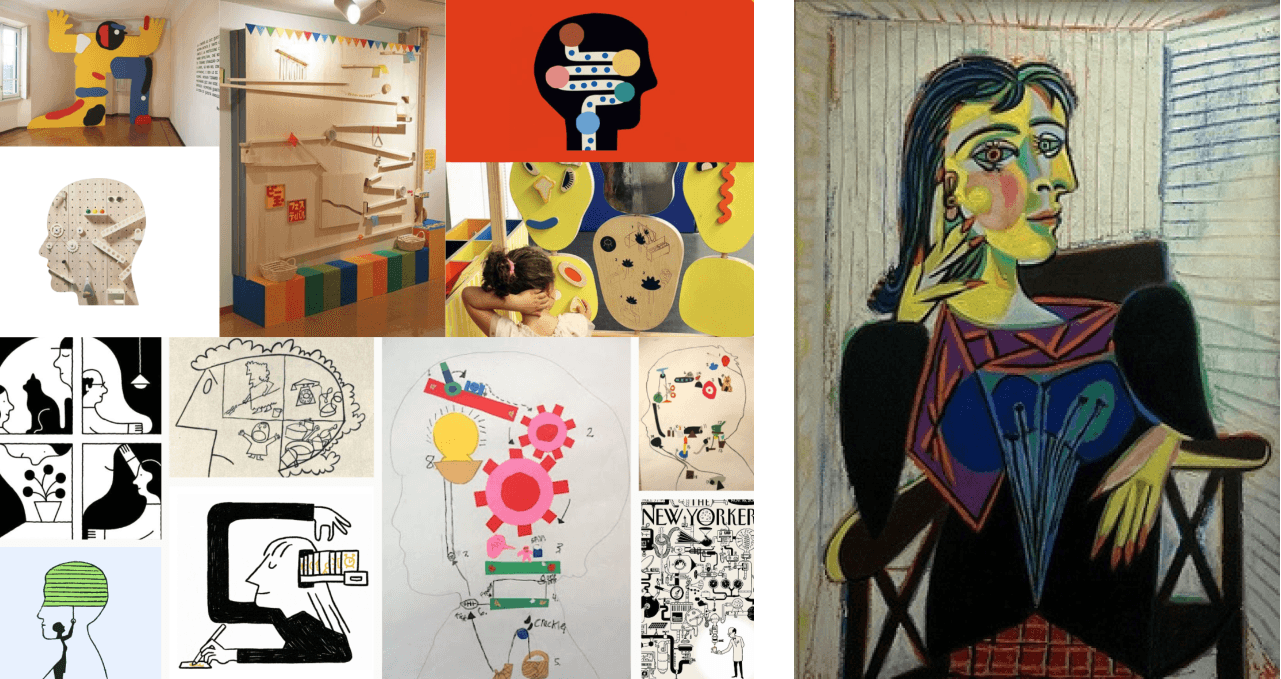
We found the answer by returning to our roots in craft, drawing inspiration from artists like Pablo Picasso, Rube Goldberg, and Saul Steinberg to blend intelligence and AI into our designs in a new way. Goldberg-esque contraptions came to represent knowledge work, while Cubism helped us convey layers of complexity. We pictured the figures from the side, the traditional pose of the thinker, so viewers could see their brains at work.
Move in closer. As our concepts evolved, we also explored new vantage points for our illustrations. Roman’s early Notion drawings showed our characters at a distance, their full bodies working and playing in various environments. But seeing them from so far away could at times feel a bit impersonal, more setting the scene than spotlighting the hero.
Rob Giampietro, Notion's Head of Creative, explains: "Moving closer is a natural part of storytelling. We lean in to see things more vividly in a film; from an establishing shot to a close-up, we engage with characters on a deeper level."
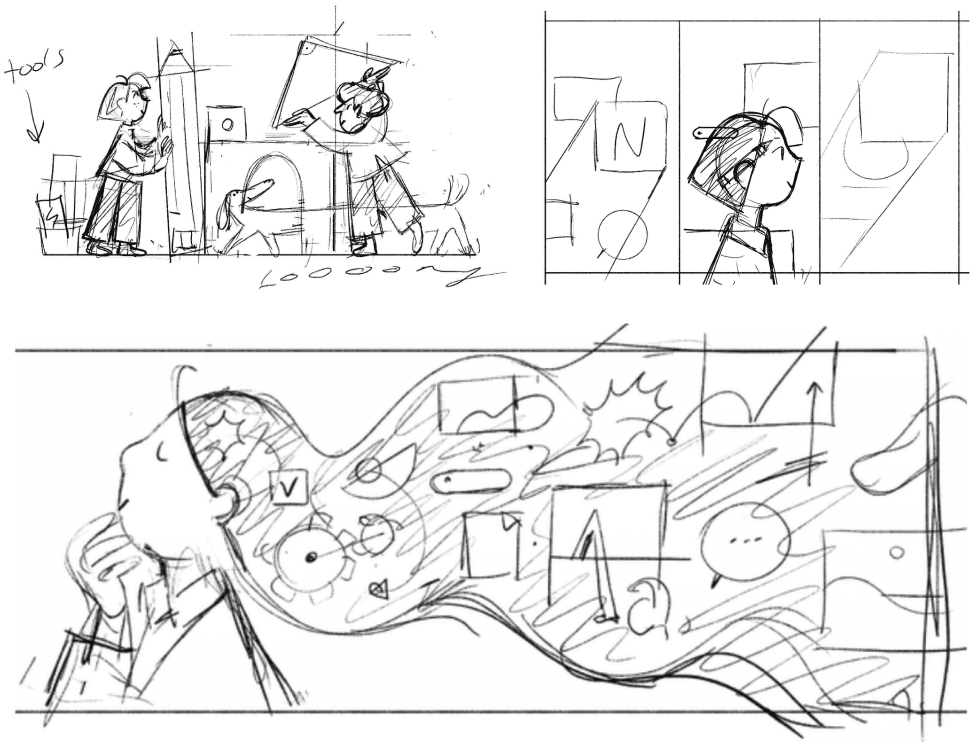
By zooming in, we got the chance to show the interior of our characters’ minds, depicting how they use Notion to think up ideas, then make them come to life. There it was: Think it. Make it.
Setting Think it. Make it. free
Once we’d landed the tagline and illustration direction, we turned to the campaign’s deliverables. How were we going to take these new creative concepts from drawing board to billboard?
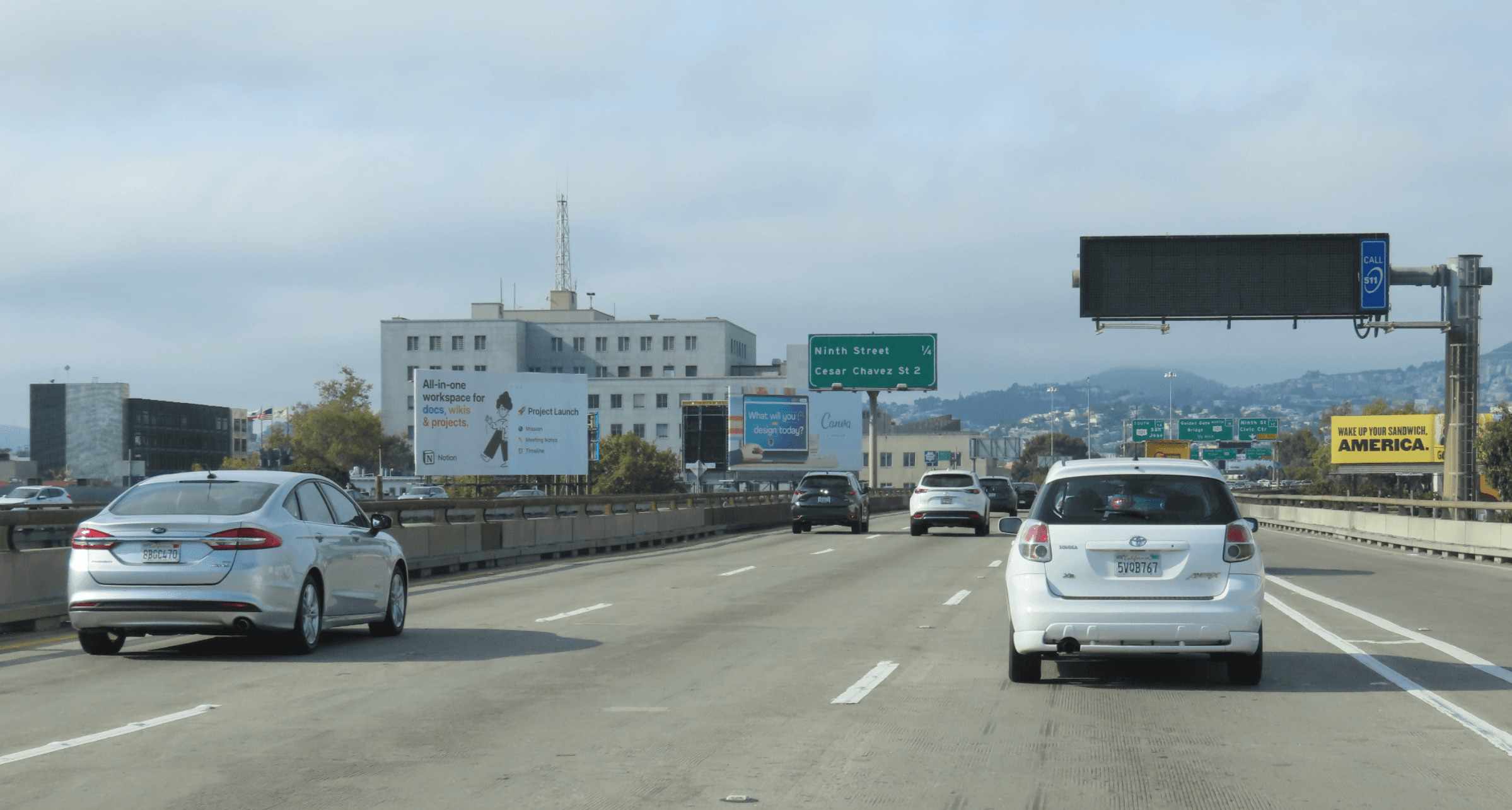
Our original branding and illustrations were all created in black and white. But cities are busy, and without color, it’s hard to stand out. Do you see the Notion ad in the image above? (If you missed it, we understand!)
While we refrain from using bright colors within the Notion app, our ads are designed to delight and excite; so for the first time, we added bold yellows, blues, and reds into our palette. Building blocks, depicted by building blocks.
Our Think it. Make it. campaign is more than a tagline. It encourages people to turn ideas into action, and represents the monumental evolution of our product. Now with AI, Notion has become more powerful and vivid than ever before, with infinite new opportunities for creativity.
We’re so excited to see how you continue to think and make in ways we’ve yet to imagine.
